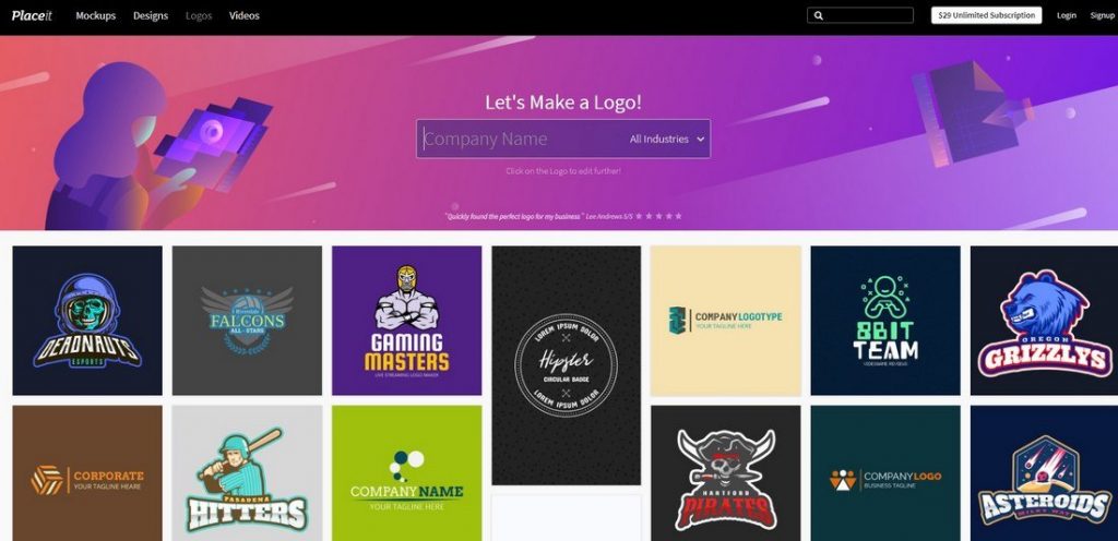
A logo represents the identity and entity of your brand, and it’s something that should speak to people, be attractive, and have a lasting impression on them. A logo represents and shows your brand, essentially, and to that end, you’ll want to have the best, and simpler rendition of yourself put all over billboards and the Internet -that’s why you’re reading this and that’s why we’re here
In the current brand landscape, competition is fierce, there are plenty of brands with amazing logos that make them stand out from the crowd, in an unforgiving battle, although a very much winnable one. You can try doing it by yourself, even though we recommend taking advantage of the best online graphic design courses, at least. However, somethings are meant to be put in the hands of professionals, and logo design might be one of them.
It’s 2020, so you should opt for a modern logo design, but what does it mean for a logo to be modern? Versatility is what you’re looking for, if you ever paid attention to modern logos of big brands, you have probably noticed how those designs fit and work everywhere from the Internet to a small stamp. But now you’re probably asking “how am I supposed to accomplish this monumental task?” -you don’t need to be concerned, because monumental (your words) this is not
To work everywhere, your logo needs to be simple, scalable, and impressive:
Simplicity, Scalability, and Impression
To quote Jeffrey Fisher, accomplished graphic designer and book author: “Simple logos are often easily recognized, incredibly memorable and the most effective in conveying the requirements of the client. […] Remember, the basis of the hugely effective international branding for the world’s largest shoe manufacturer is a very simple graphic swoosh
As you may have gathered, simplicity means using few colors, text, and elements, making logos memorable, instantly recognizable at any distance, and work perfectly in every medium, as does the Nike logo -simplistic, with no actual colors or text and greatly effective at that, as we all know. Take also Apple’s logo, for example, it’s ultra-modern, clean, and simple with no colors or text, and doesn’t work just as an identifier of the company, but it’s also a symbol of their
products and methods; it’s a multi-purpose logo and one of the most effective out there. The point of all logos is to represent the identity of the brand while making it easily identifiable
Distinction
Make it simple but not bland -remember, there’s a lot of logos floating around everywhere, so yours needs to be unique, enticing, and in other words, impressive -base your design on a new, unheard concept, while being connected to your business. Your logo is meant to stand out and grab people and the market itself, so you can also try to do some research and find out what people are psychologically attracted to subconsciously.
Colors
Next, a maximum of 4 colors should be what you’re aiming for: the Google logo has 4 colors; YouTube has 3; Apple, Samsung, Target, BBC, and Adidas have single color logos -you get the pattern. This, in addition to a simple design with few lines and elements -something anyone of us could draw quickly with a pencil -makes it easy for our brains to store the information and quickly recognize a logo and remember what brand it belongs to.
Medium Versatility
However, your logo needs to work EVERYWHERE: the internet, billboards, legal documents, stamps, brochures, TV, newspapers, cardboard boxes, product packaging or in the products themselves, and a lot of other scenarios that would occupy too much space if I were to list them all. The point is: logos have to fit every possible scenario and still be recognizable, hence part of the importance you should be giving to your color choice and simplicity of your design.
You have to make sure that, in different mediums and proportions, your logo belongs, doesn’t look odd nor loses any design details and its identity. To achieve this you could follow Apple’s example, maybe leave text out of it and create a singular simple logo that can be easily scaled up or down; or, if your logo is text-based, make sure you have multiple renditions of it to cover every scenario, Walt Disney, for example, usually trims the “Walt” part out to make it smaller and more versatile or only leaves the “D”, all while still having a greatly recognizable and effective logo. It’s very unlikely that you’ll ever meet someone who doesn’t know what the “D” with its specific font refers to. The key is having a unique identity that stands out from the oversaturated crowd.
In the end, you should be left with a simple and impressive logo that works absolutely everywhere
Conclusion
Having a great and versatile logo is one big step further into making your business heard of and recognizable out in the wild. Hopefully, we made the process easier and more bearable. Follow these tips, and then maybe call back to boast your success. Jokes aside, we do wish your logo turns out great because if not, it’s partially our fault. Thanks for reading

